1. Introduction to CSS Framework
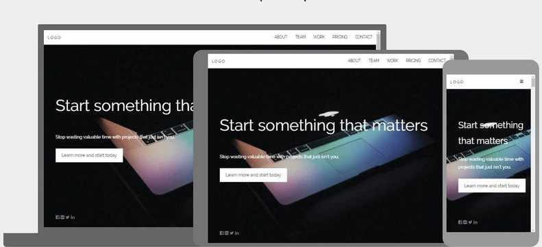
In the previous post we already know how to use CSS to make a website interface but do you realize if any Web form we also have to rewrite the CSS from scratch will take time? Not to mention that the website needs optimal display on both mobile devices and many other devices with different screen sizes, doing a theme will become very time-critical.

Therefore, the concept of CSS Framework, CSS Framework (CSS Library) is a pre-written CSS file that has been integrated with the selector, attribute and value available so that we can use always and avoid repeated work during the creation process CSS classes, and the same HTML snippets in your Web project. All CSS properties are appended to classes and classes that have a certain naming rule to memorize the classes easily for example you just need to add the class “BTN” to the button that gets better in a CSS framework called bootstrap
<a href="#" class="btn"></a>Press
Press
There are currently a lot of CSS frameworks: Bootstrap, W3CSS, Fundation,.. But most used is bootstrap so at the first stage you just need to use bootstrap only.
2. Lesson Objectives
- Understanding CSS Framework concepts, importance, usage
- Know how the Boostrap uses
3. Learn how to use bootstrap
Bootstrap is now out to version 4 so we will be using version 4 (boostrap 4).
How to Install
You just need to insert the following tags into the header, it’s like downloading the CSS file on the machine and putting the path into the HTML file but here we don’t need the download that uses directly
 <html></html>
    <head></head>
        <link rel="stylesheet" href="https://maxcdn.bootstrapcdn.com/bootstrap/3.3.7/css/bootstrap.min.css" integrity="sha384-BVYiiSIFeK1dGmJRAkycuHAHRg32OmUcww7on3RYdg4Va+PmSTsz/K68vbdEjh4u" crossorigin="anonymous">
        <link rel="stylesheet" href="https://maxcdn.bootstrapcdn.com/bootstrap/3.3.7/css/bootstrap-theme.min.css" integrity="sha384-rHyoN1iRsVXV4nD0JutlnGaslCJuC7uwjduW9SVrLvRYooPp2bWYgmgJQIXwl/Sp" crossorigin="anonymous">
        <script src="https://maxcdn.bootstrapcdn.com/bootstrap/3.3.7/js/bootstrap.min.js" integrity="sha384-Tc5IQib027qvyjSMfHjOMaLkfuWVxZxUPnCJA7l2mCWNIpG9mGCD8wGNIcPD7Txa" crossorigin="anonymous"></script>

    <body></body>
Or you can download the following link: https://getbootstrap.com/docs/3.3/getting-started/
Note: To identify mobile devices that require the following code in the head card
<meta name="viewport" content="width=device-width, initial-scale=1">
Here’s how to use bootstrap to do some simple operations
Example 1: To divide the website into 3 columns where there is 1 largest main column in the middle as the first post, we have to style a lot for the div tags, but when there is bootstrap, it becomes extremely simple :
<div class="container"></div>
    <div class="row"></div>
        <div class="col-md-2">Column 1.</div>
        <div class="col-md-8">Column 2</div>
        <div class="col-md-2">Column 3</div>
<nav class="navbar navbar-inverse"></nav>
  <div class="container-fluid"></div>
    <div class="navbar-header"></div>
      <a class="navbar-brand" href="#">WebSiteName</a>

    <ul class="nav navbar-nav"></ul>
      <li class="active"><a href="#">Home</a></li>
      <li><a href="#">Page 1</a></li>
      <li><a href="#">Page 2</a></li>
      <li><a href="#">Page 3</a></li>
You can minimize the half-browser to see the variation of that menu. From now on you’ll have to get used to using the bootstrap menu, you’ll only need to style the color and width of the menu to suit each project.
Example 3: Create a form using bootstrap
Code
<form></form>
  <div class="form-group"></div>
    <label for="exampleInputEmail1">Email Address</label>
    <input type="email" class="form-control" id="exampleInputEmail1" aria-describedby="emailHelp" placeholder="Enter email">
    <small id="emailHelp" class="form-text text-muted">We'll never share your email with anyone else.</small>

  <div class="form-group"></div>
    <label for="exampleInputPassword1">Password</label>
    <input type="password" class="form-control" id="exampleInputPassword1" placeholder="Password">

  <div class="form-group form-check"></div>
    <input type="checkbox" class="form-check-input" id="exampleCheck1">
    <label class="form-check-label" for="exampleCheck1">Check Me Out</label>

  <button type="submit" class="btn btn-primary">Submit</button>
We might have noticed that the input cells and buttons are a lot more beautiful than you do:)) OK so this is through three examples of the hope that you understand how bootstrap works.
You can click here to read more bootstrap documentation: https://www.w3schools.com/bootstrap/bootstrap_grid_basic.asp
Click here to view the demo (example) of bootstrap: https://getbootstrap.com/docs/4.1/examples/
Learning through the example is always very important, you can see 1 example and compare it to your project to see which one is so close then you will know how to do, even more people skip the theoretical reading that instantly see examples of it To learn how to use it always.
Practice.
Here I need you to complete the following exercises to be able to apply bootstrap at work. Note that you need to do so that the interface can render properly on each device as shown below
Large size
Medium size
Small size

 Tiếng Việt
